Artist Reception:
Saturday, July 11th 5-7 PM
Meet artist Barbara Clark and enjoy light refreshments with neighbors at Baas Framing Studio!
2703 E Madison Street, Seattle WA 98112
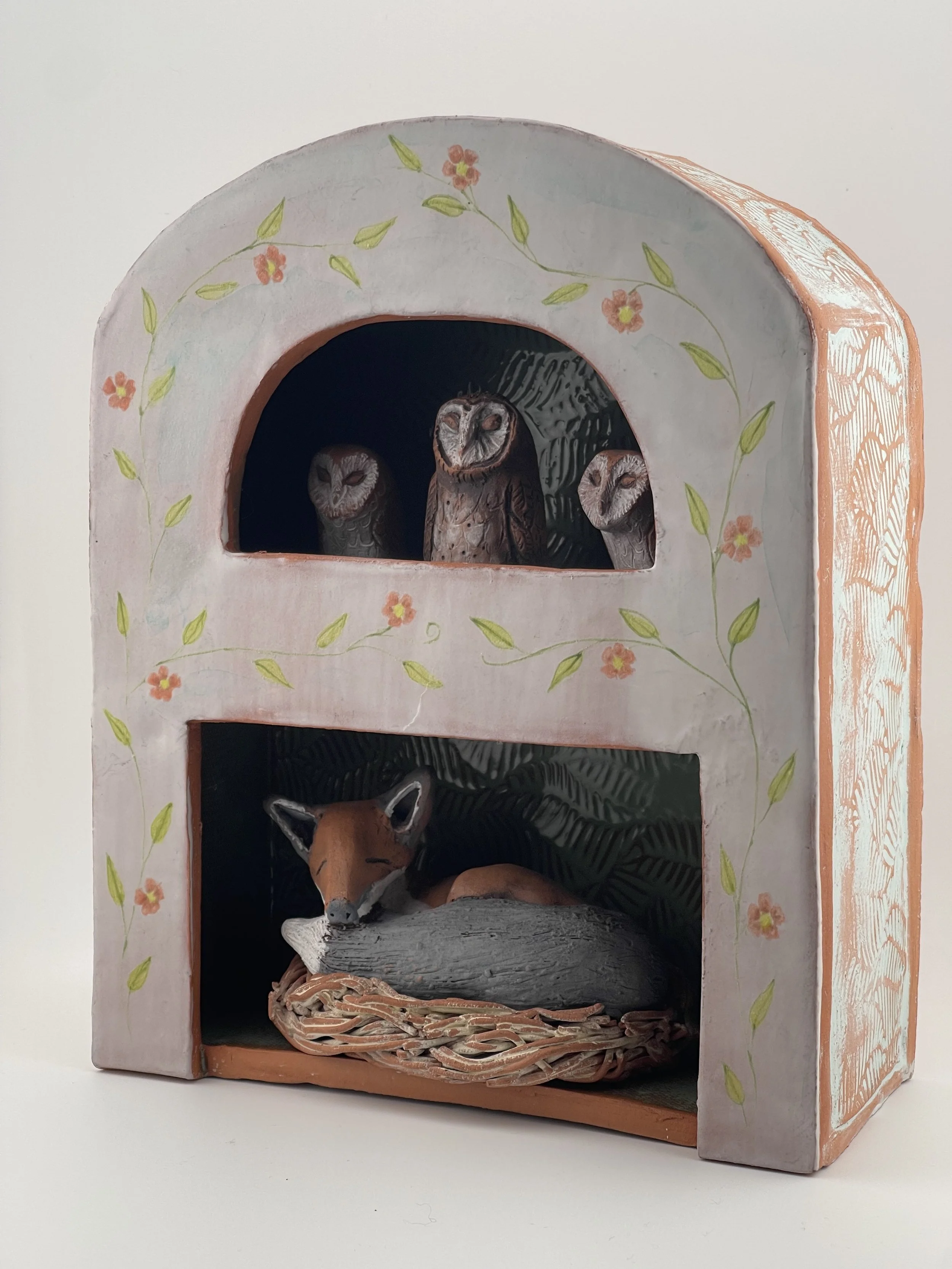
“Fox with Owls”, Terracotta with Majolica Design, 9” x 7.5” x 3”
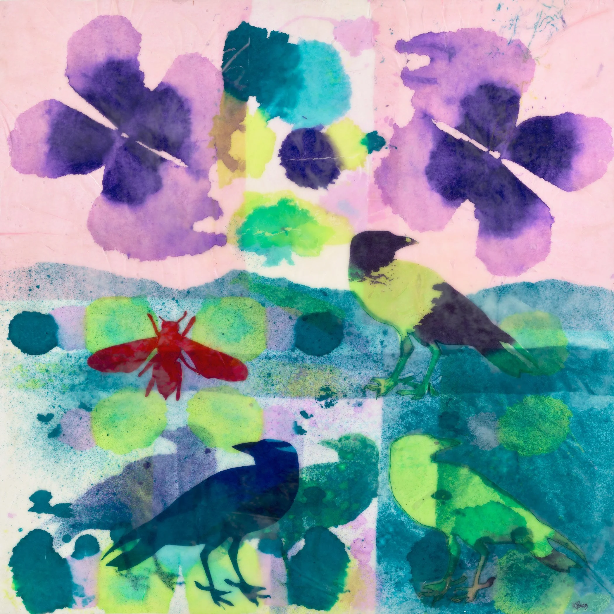
Join us for special summer art exhibition with local artist Barbara Clark!Clark’s charming drawings and ceramics pull directly from her love of nature and all its wonderful creatures. Full of both whimsey and a quiet reverence, these artworks are a perfect celebration of the natural world.
"The more I explored, the more strange and wonderful animals I discovered." -Barbara Clark